If you’d like to support my on-going work to bring you a fresh Ethereum-packed newsletter every week day, feel free to make a donation on Gitcoin here (the donation will be matched quadratically during the current matching round).
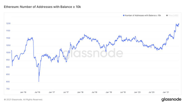
I love analyzing on-chain data of crypto networks because the various metrics represent the “beating heart” of a protocol or project. But it’s important when looking at these metrics to not draw false conclusions from them based on some inherent bias. For example, the chart I posted below may lead you to believe that ETH may experience positive price action soon because you are bullish and think that “whales” are still accumulating. Though, of course, this misses a lot of the nuance.
I think that as more tools have come online to monitor on-chain metrics, the less valuable they have become. This is because once a measure becomes the target, it ceases to be a good measure. In other words, if everyone is focusing on some on-chain metric then there’s a high chance that metric will be gamed or cease to be useful for some other reason. For example, many people like to watch centralized exchange inflows/outflows of coins for bearish or bullish signs but at this point enough people are now watching this metric that it’s become self-fulfilling. This means that if a whale wants to, they can send a large amount of coins to an exchange address to “psyop” the market into thinking that they’re going to sell. In reality, those coins are just sitting on an exchange while that whale is either shorting the market or buying the dip that they created.
I think taking lots of different on-chain metrics together in aggregate can be a good way to “health check” a network from time to time. For Ethereum, the amount of gas fees being paid (aka protocol revenue) is a pretty good indicator of how in-demand the chain is but even then, with tools like Flashbots, this indicator has now become less useful (because the chain could still be in high demand, but you won’t see that demand show up in the public fee market). So in this case, you’d want to look at something like the number of active addresses and in what direction it was trending but even this metric will become less useful in the future (because more and more users will be transacting on layer 2).
Finally, it’s usually quite difficult to discern if an on-chain metric is a leading or lagging indicator. For example, is the fact that lots of stablecoins are flowing to exchanges a leading indicator because it shows people are getting ready to buy crypto? Or is it a lagging indicator because it’s showing that people already cashed out somewhere else (possibly through a DEX) and are going to an exchange to swap their stablecoins for fiat? Either way, it’s just very difficult to look at a single indicator and draw conclusive evidence from it about what the market will do.
If you’d like to dive deeper into the on-chain data yourself, there are plenty of tools now that will allow you to do just that. I recommend The Block’s dashboard here, Glassnode Studio here, Dune Analytics here, and Into the Block here. Though if you don’t have time to dig into the data yourself - never fear - I actually do an on-chain data recap of both Ethereum and DeFi once a month via my YouTube channel and you can check out this month’s episode here.
Have a great day everyone,
Anthony Sassano
Join the Daily Gwei Ecosystem
All information presented above is for educational purposes only and should not be taken as investment advice.


