Beautiful Ugliness - The Daily Gwei #266
Why focusing on "ugly" user interfaces is the wrong approach.
Curve released v2 of their protocol today and detailed it in a new whitepaper that’s full of advanced mathematics that I really have no idea how to decipher. So for today’s piece, instead of focusing on the details of v2, I wanted to focus on something else I saw people talking about again over the last 24 hours: the fact that Curve’s UI/UX is “ugly” and difficult to use.


I think what a lot of people miss when they bring up issues with a project UI/UX is that the “official” UI is only one in a sea of others. For example, you don’t have to use Curve’s UI to trade using their protocol (you can do that via a DEX aggregator) and you don’t have to use it to provide liquidity (you can do that via something like Zapper). This is because the smart contracts are essentially open financial API’s that allow anyone to build on them - this concept is sometimes referred to as “money legos” and is a major reason why DeFi is such a breakthrough in finance.
So from this point of view, I think it’s unfair to judge a project based on the “official” UI experience that the team has built. I mean, taking Curve as an example again here, it’s not like their TVL or trading volumes have suffered from this - Curve is still #4 on DeFi Pulse with $7.35 billion TVL and is the 4th most popular DEX on Ethereum with $617 million worth of trading volume over the last 24 hours. Over time, I’m sure the Curve team plans to improve their UI, but in the meantime there will be plenty more teams that build out their own experiences that sit on top of Curve’s contracts (among others).
In saying all of this, general crypto UI/UX probably still has a long way to go before it’s ready for grandma to use but I do think people are just being impatient and missing the forest for the trees. DeFi as an industry really only started taking off in June of 2020 and before that it was a niche within a niche that even very few hardcore Ethereans used. So the fact that we’ve come so far in just a year with all of these limitations (infrastructure, scaling, UI/UX) is absolutely insane and should be applauded. On top of this, I think there are already plenty of beautiful DeFi UI’s around today such as Matcha (a DEX aggregator that is honestly so comfy to use), Rainbow Wallet (a mobile wallet that makes DeFi feel like a game) and I really love what Maker have done with their Oasis app (it’s very user friendly).
If history is anything to go by, all new technologies will start out with poor UI/UX that then rapidly improve over time (I’m sure many of you remember just how insanely poor the UX was for dial-up internet). So just be patient, embrace being a pioneer of this revolutionary new industry and always remember the age old saying: don’t judge a book by its cover!
Have a great day everyone,
Anthony Sassano
Join the Daily Gwei Ecosystem
All information presented above is for educational purposes only and should not be taken as investment advice.


Agree with you too Anthony and I might be biased but I deeply think that UX/UI increases the degree of democratization of projects. Isn't it the whole point ? :)
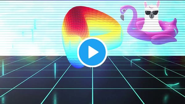
Curve's results speak for themselves, but as a designer you can't resist to bring some fan-art to the community !
https://twitter.com/VictorOlsonLab/status/1402707887571574784?s=20
Cheers!
While I do agree with several of your points here I think the industry (while still very young) should prioritize the ease of use with each UI that is designed.
This is the trap technology runs into because at the moment technical people are creating these interfaces with heavy jargon and complicated/overwhelming experiences. It is my belief that it shouldn't be an excuse and that UX should be simplified for larger adoption.
There's a ton of references to make good UI's from. It's not like pre-iPhone UX where every gesture was invented.